Grow a Heart is non-profit organisation based in Cape Town. They place qualified life coaches in schools to help them navigate life. a They also help schools to better serve their communities by involving the youth. They approached me to redo their entire aesthetic.
logo redesign.
The client wanted a more updated, modern logo that would communicate their influence over youth, but still keeping it classy for a more marketable look.
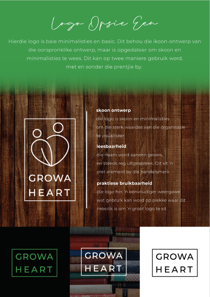
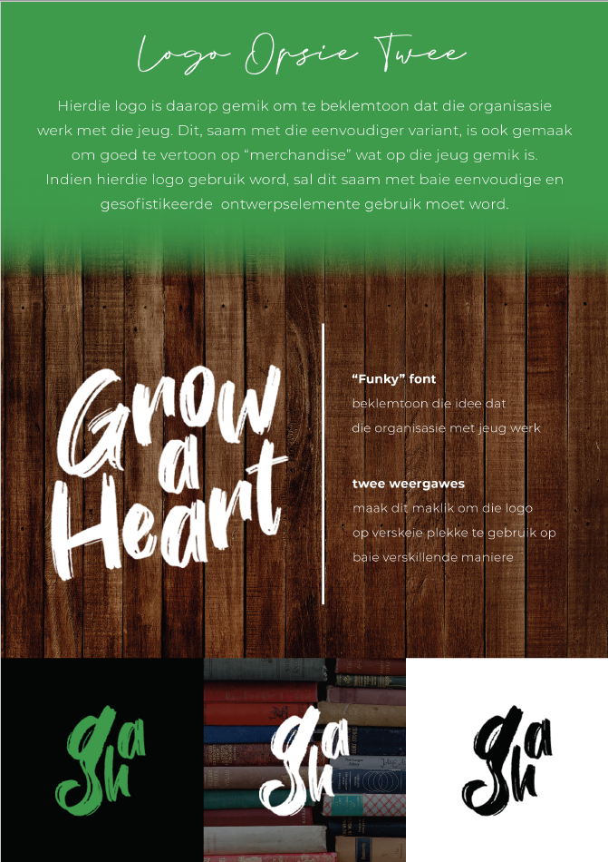
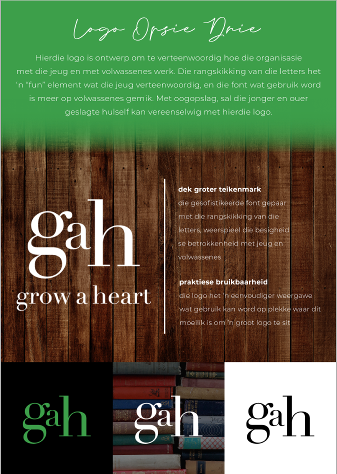
after considering the three options that I came up with, the client chose logo # 3. Below is the logo icon an the full logo.
final logo icon
final full logo
website.
The biggest part of this project was, of course, the webiste. I needed to apply the new look & feel of the organisation throughout, while still keeping with the original function of the website. I merely updated the look and improved the website flow - I did not have anything to do with the information given on the website.
look & feel update.
Along with the updated logo, I had to update the organisation's entire "look & feel". I came up with three options, and gave examples of how it could look in practice on social media
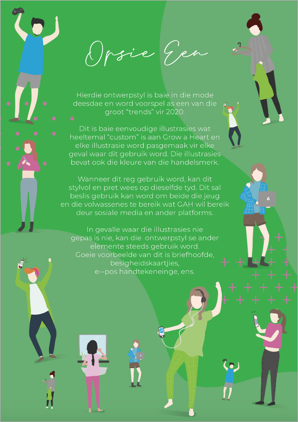
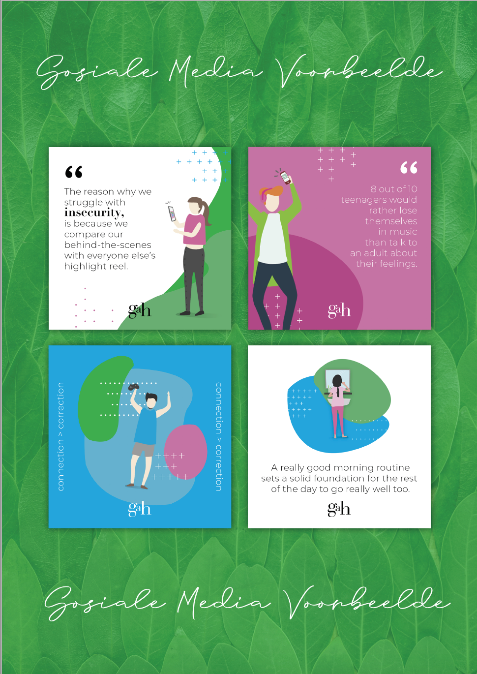
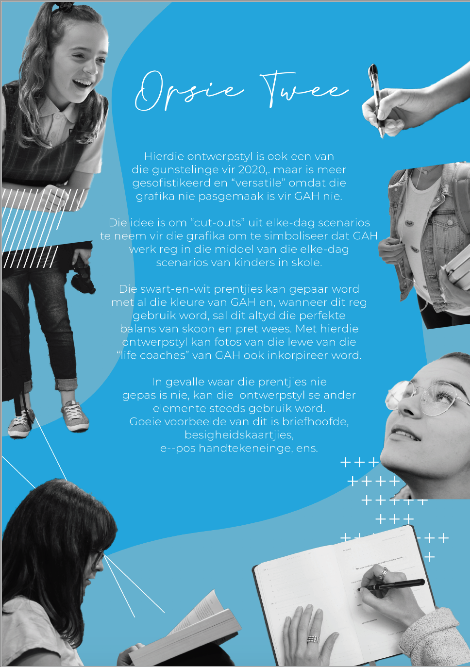
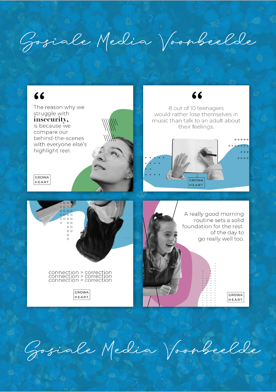
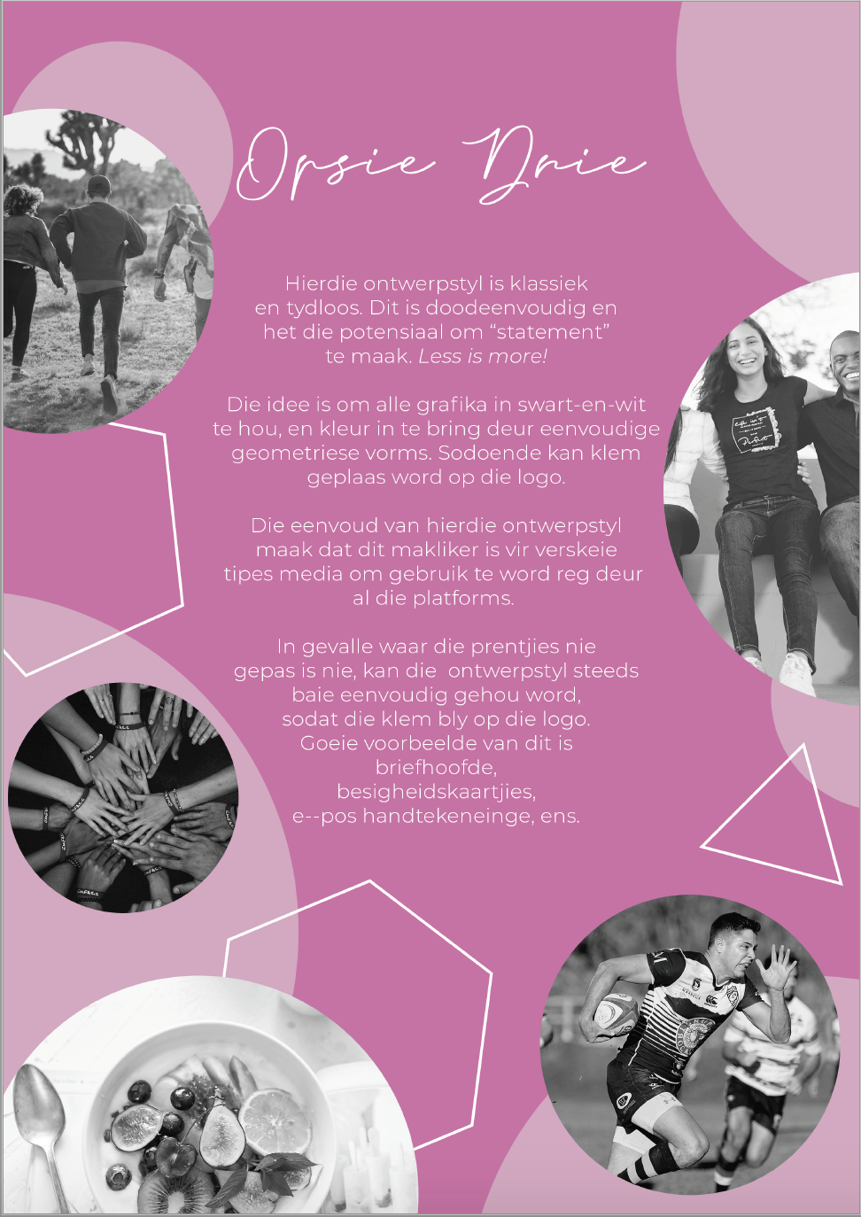
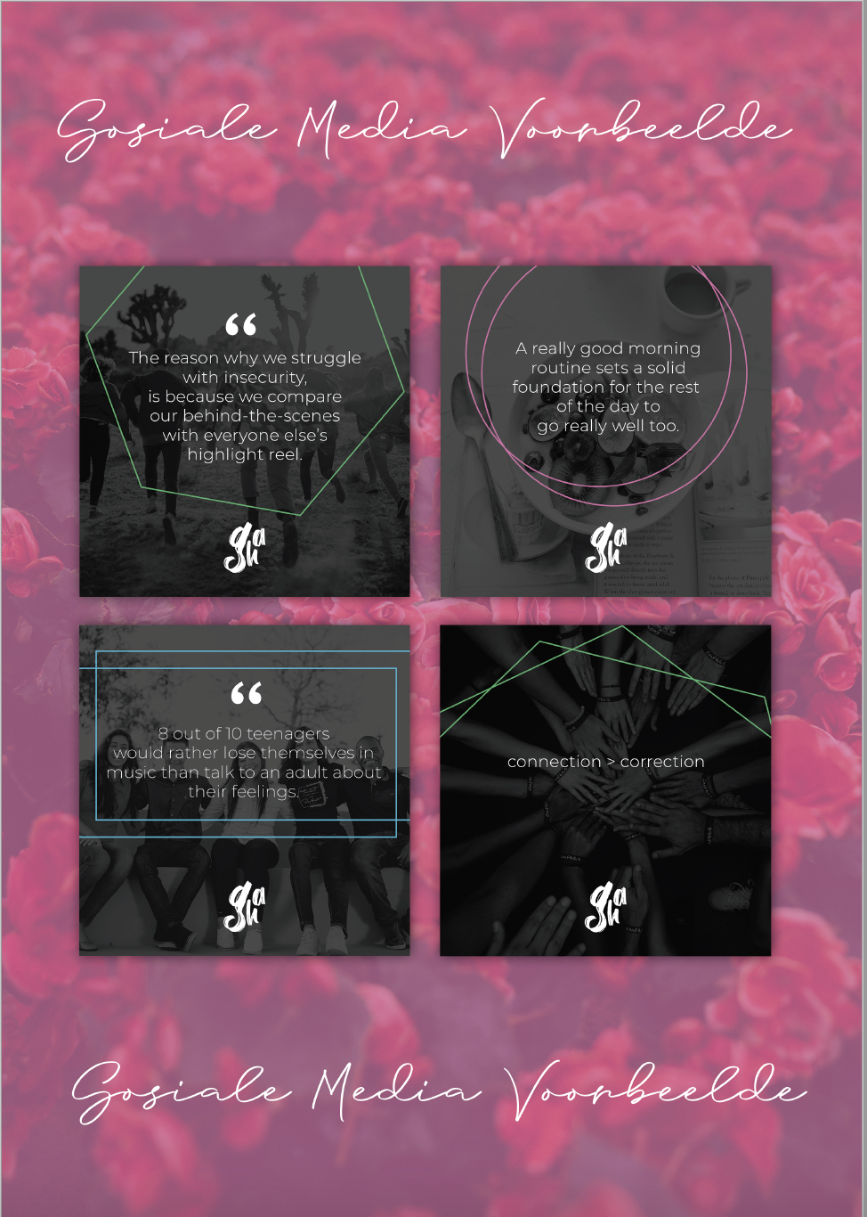
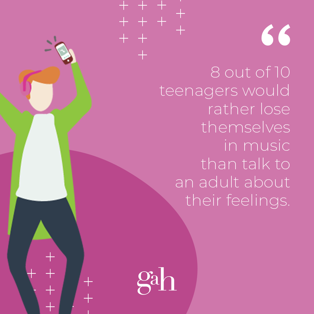
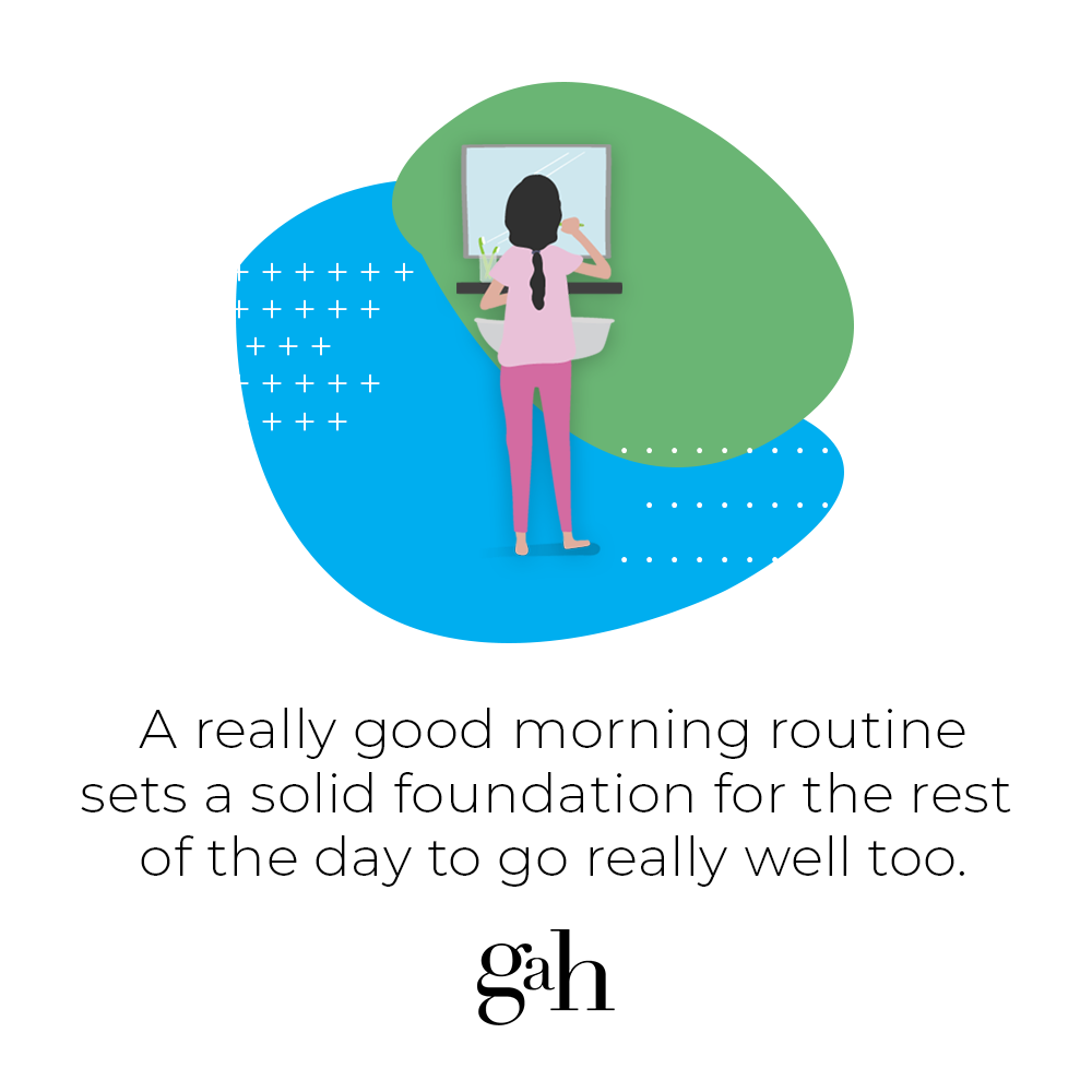
The client decided to go with the first option. I illustrated the characters for them and delivered it in png and vector formats.

brochure design.
This client put a lot of emphasis on an updated brochure design, as they mainly use this as marketing at schools and businesses where they get sponsors.
brochure outside.
brochure inside.
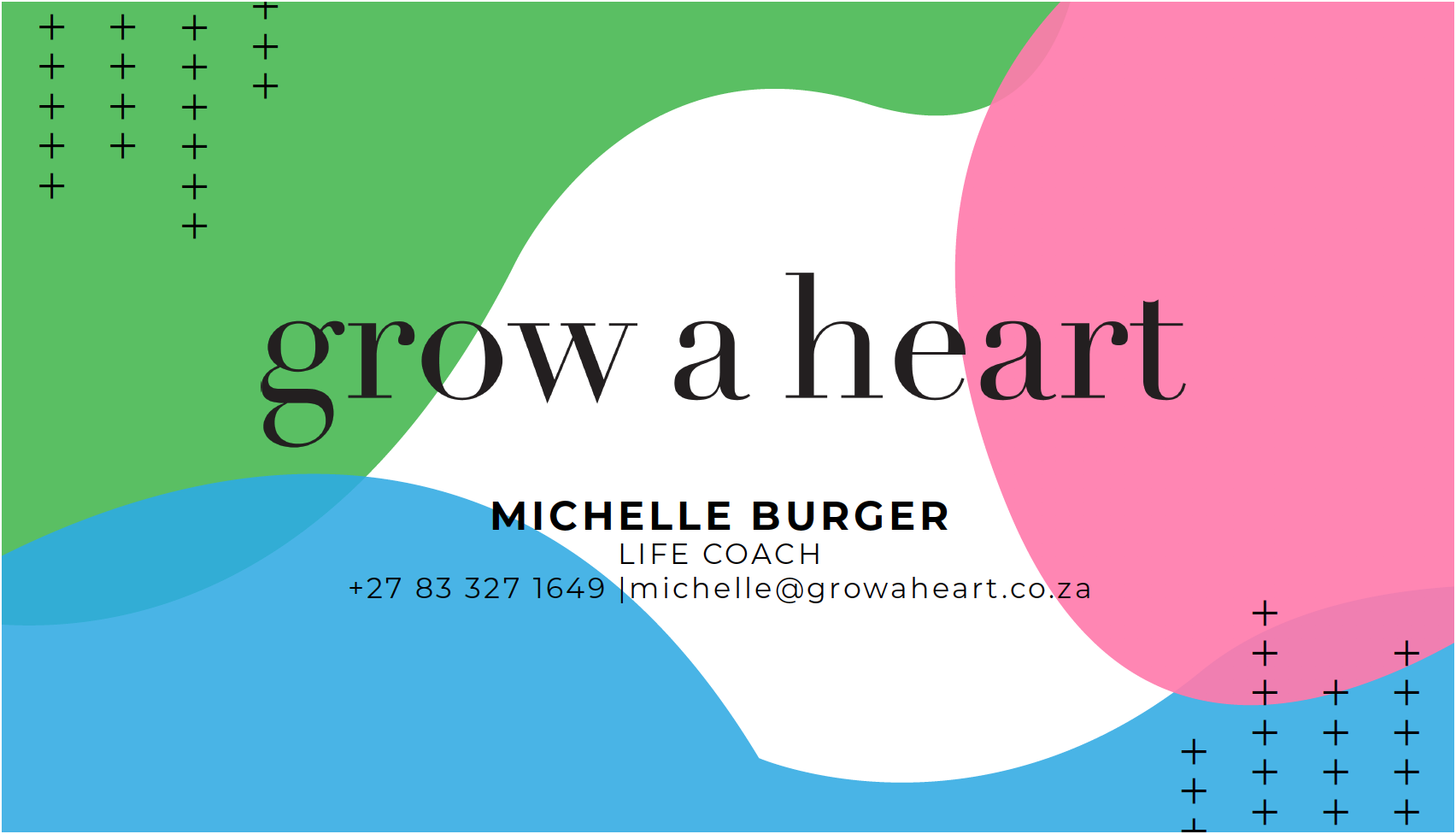
business cards.
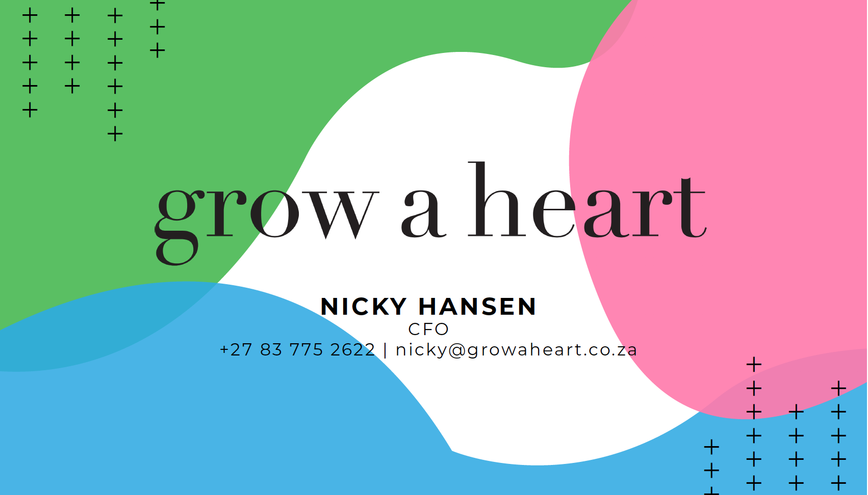
The client requested new business card designs that would use the new design look. They asked for something simple that could be customised for all their representatives. I delivered printable files and editable design files.


other deliverables.
Together with all of the above, the client requested designs for some other basic brand identity items.
email signature.
letterhead